

 (fonte da imagem: the sweet escape)
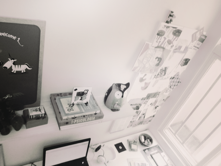
Esse quarto (pelo menos o que aparece na foto) é bem básico. O que me chamou atenção foi a combinação de cores. As paredes são brancas, ou seja, de uma cor neutra. A arte na parede – uma ilustração emoldurada em paspatur – é despojada mas também tem cores neutras. Isso facilita a que o quarto esteja sempre com uma “cara” nova, porque capa de almofada, travesseiro e colcha de cama a gente sempre troca, não é? E no caso dessa foto, amei a mistura de rosa claro, amarelo e laranjado (notou que o amarelo na almofada é um desenho de caveira? Assim como o enfeite sobre a mesa lateral). O quarto faz o estilo hight/low, que mistura itens caros com coisas baratas, por exemplo a mesa lateral e o abajur. Aliás, é uma ótima dica para quem quer economizar, sem deixar tudo muito pobrinho: Misturar. Às vezes um objeto com um design mais legal já dá outro clima!
What caught my attention in that room was the color combination. The walls are white, in other words, are neutral. The art on the wall – a framed illustration with paspatur – is cool but also has neutral colors. This facilitates that the room is always with a new look, because cushion cover, pillow and bed quilt we always exchange, isn’t? I loved the mix of light pink, yellow and Orange (Have you noticed that the yellow pillow is a drawing of skull? Just like the ornament on the side table). The bedroom has the high/low style, mixing expensive items with cheap stuff, for example side table and lamp. Indeed, it is a great tip for those who want to save without leaving everything very poor: Mix. Sometimes only an object with a nicer design already gives another look!
Beijos! → Instagram


No Comments